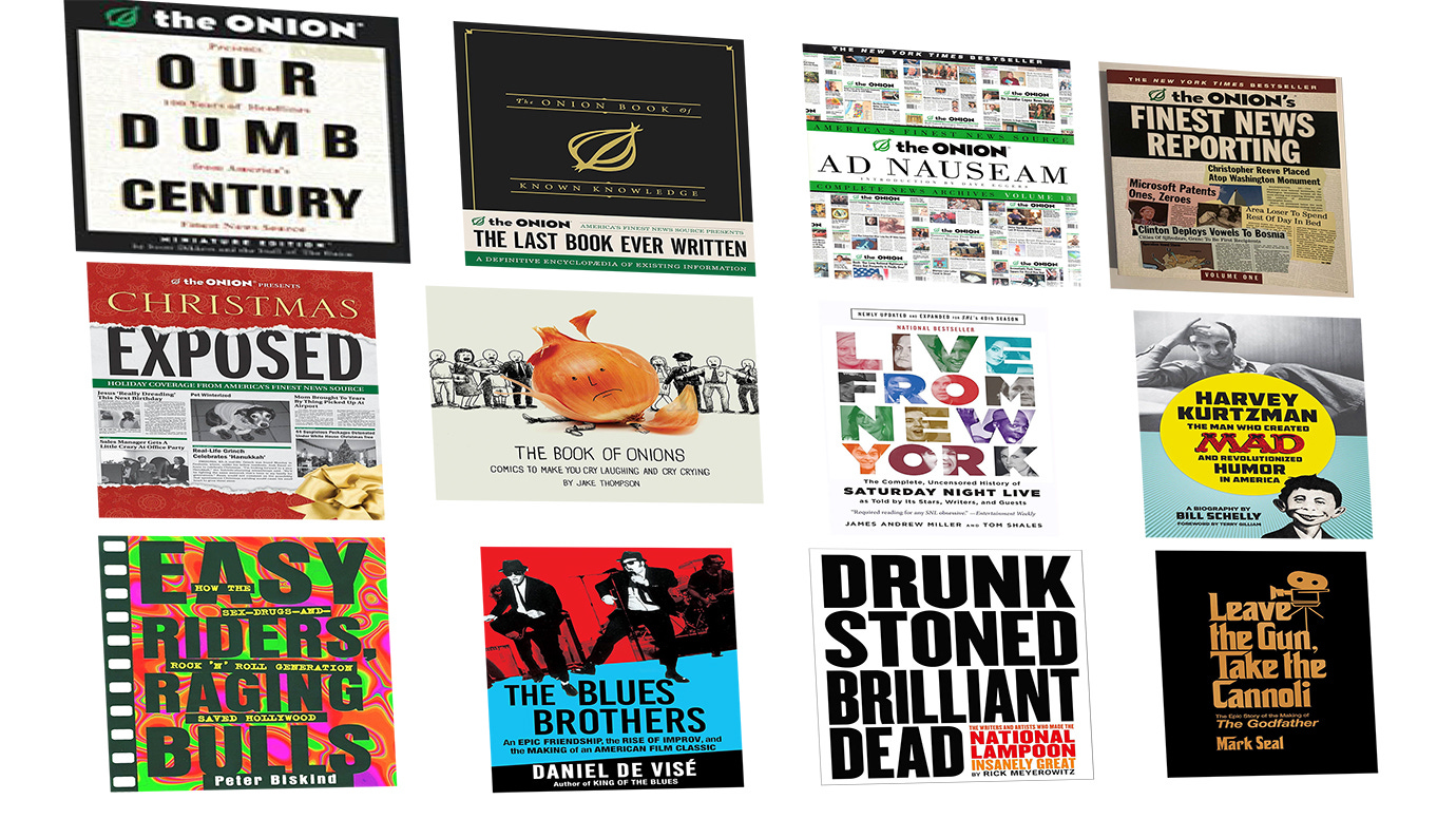
I got an email from the cover designer of my book, The Onion Story. She sent some covers of similar books (above) and asked for my thoughts.
If you’ve been following this project by checking out the book proposal and draft chapters I’ve uploaded in recent months, I thought you might like to see more of this process. In particular, my response to her about the cover, below:
My two cents on this is that "funny" is not exactly the feeling I'd go for. The other suggestion you had of big and bold is more my speed.
To evoke the spirit of The Onion but put my spin on it, I'd recommend focusing mostly on the Onion branding I was involved in: Our Dumb Century, The Onion's Finest News Reporting, Our Dumb World, The Onion Radio News, and The Onion News Network (links and attachments below). These aren't exactly "comedy" designs. They represent The Onion's character, which has a visual brand identity that says big, imposing news organization, the final authoritative voice in news. Any residual "funny" comes from the inherent irony. This photo of The Onion's fake corporate headquarters is another good visual representation of what I'm talking about.
Other images, if you're looking for image ideas: newspapers rolling off a printing press / anchor at a news desk (maybe rear view?) / collage of front pages of The Onion.
Yes, you're right about the logo. The agreement I made with The Onion was that I have the right to show issues of The Onion I edited and articles I wrote, but that’s it. I've done that over the years with no problem..That said, the people I made that agreement with are long gone and there are new owners now, so who knows.
Most of the other Onion books in your comp list are flat and more "intellectual" looking, like they're trying to parody NPR or The New York Times. I wouldn't want to use those for inspiration. The only exception is the Christmas Exposed book -- they did a good job with that one. Another book on this lineup I wouldn't use is The Book of Onions. It's not affiliated with The Onion or me. I've never been a fan of the physical Onion vegetable as part of Onion branding.
The other covers do a great job of capturing the vibe of their respective brands. Ideally that's what The Onion Story cover does -- capture the Onion brand as I always saw it (BTW Mallory and I discussed changing the title to “The Onion Story”). I like the Live From New York cover best of all these. If you want to do a photo collage like that, let me know so I can compile photos for you.
Thank you! I'm excited to see what you come up with!
Thanks for this behind-the-scenes look at how business is done.
What? Real onions aren't apeeling? Sorry Not Sorry :D