
The New Pepsi Logo and the Plumber
The New Pepsi Logo and the Plumber
An important observation

Some observations don’t have a real-world application. They languish on the idea list and you never know what to do with them.
Graphics Editor to the stars Mike Loew, whom I worked with at The Onion, shared one of these observations with me a long time ago, when Pepsi redesigned their logo.
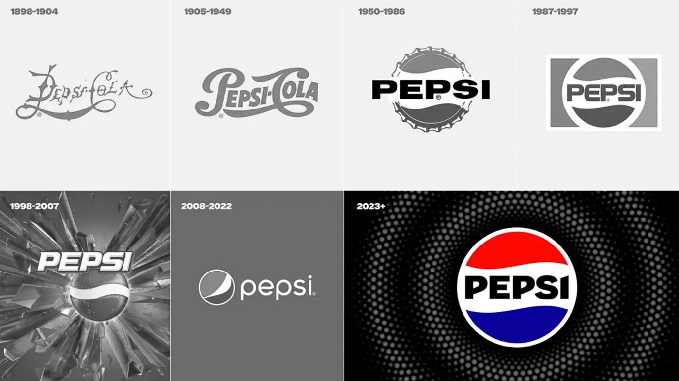
Having been around for over a hundred years, PepsiCo redesigns their logo every couple of decades. They just redesigned it again, last year.
Obviously, when a logo for a brand as big as Pepsi gets redesigned, legions of brand experts, marketing geniuses, psychologists, phrenologists, and God knows who else, are brought in to make sure they’re maximizing impact.
What Mike discovered, and I believe he was the first to notice, was that Pepsi’s logo could be turned into a visual gag by adding just one line:
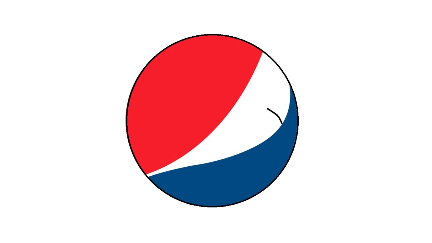
Juvenile? Yes. And also funny.
While their new logo is more machine like, the old logo revealed that companies use subliminal cues to put us in the state they want.
We all laugh when we see a plumber’s butt crack. It’s automatic. Maybe Pepsi knew what they were doing.
TODAY’s TIP:
Use the shapes of nature.
The shapes of car hoods look like dog’s snouts. We like dogs. They’re our best friends.
Products meant to convey power often use the shapes of predators or fire in industrial or logo design. Products meant to be fun, safe, or helpful often use the shapes of fruits or nuts.
See if you can imbue your work with a layer of subliminal messaging.
Since I ran out of space yesterday, below are two early and edited chapters from The Onion Story. Enjoy! More tomorrow.
Keep reading with a 7-day free trial
Subscribe to No Dikkering Around to keep reading this post and get 7 days of free access to the full post archives.